
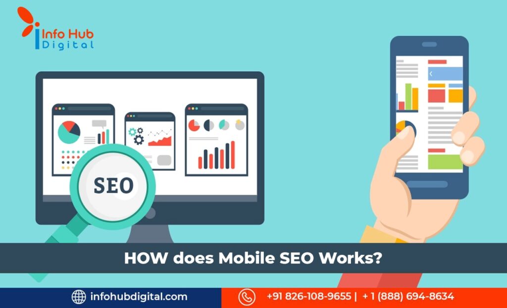
Is your website mobile friendly? Are you losing out on potential customers due to lack of a responsive design? So, what is mobile SEO and how does it work to increase profits for your business? Mobile SEO is the process of optimising websites for search engines while ensuring that they display perfectly on mobile devices like smartphones and tablets. In the first place, Google claims that mobile websites often operate in one of three configurations:
1. Responsive Web Design
2. Dynamic Serving
3. Separate URLs
In contrast to desktop, mobile search engine optimization (SEO) is influenced by the user’s location, the size of their screen, the operating system of their device, and more. It is possible to enhance your rankings throughout devices and expand your business by being aware of these variances.
When optimising for mobile devices, there are a few more considerations if your site is already effectively optimised for search engines. Below are some of the best practices for mobile SEO –
Mobile Content
The same identical material from your desktop site should appear on your mobile site, to summarise mobile SEO. All content types (text, video, image, etc.) ought to be able to be indexed and crawled on mobile devices. For picture search, Google altered their app and mobile results to display badges. This indicates that the image alt characteristics you’ve been disregarding are now even more crucial for mobile search. Also, you might want to think about harmonising your content in light of the growth of voice search.
Page Speed
For mobile users specifically, page performance is much more crucial than for desktop users due to hardware and network concerns. In addition to image optimization, you should minify your code, use browser caching, and minimise redirects.
Use Rel Canonical
In order to prevent problems with duplicate material, canonical tags are utilised. Google will effectively index all pages of your mobile website and won’t mark any content as being unoriginal if you include the rel-canonical tag to it. By combining indexing and ranking indicators, such as external links, it will avoid confusion.
Structured Data
People using mobile devices to browse the internet don’t want to have to wait for any new windows to open. Google and users like websites that open quickly and efficiently in a matter of seconds. You can use the page speed tool to analyze your average download time and correct any issues that are slowing things down.
Local Search Optimisation
Remember to localise your mobile content if your company has a local component. This entails standardising your identity, location, and contact information as well as adding the names of your state and city to the metadata of your website.
Do Not Block CSS, Images or JavaScript
In the past, webmasters of mobile sites might have disabled one or all three of these features because some mobile devices couldn’t support all of them. However, the Smartphone has changed that for the most part. The goal of GoogleBot is to be able to see and classify stuff just like users do. Don’t hide it, then. These components are essential for aiding Google in determining whether your website is responsive or uses an alternative mobile solution.
Site Design
The design of websites is being revolutionised and made simpler by mobile devices. In modern times where we scroll continuously, the phrase “above the fold” has lost any significance.
Optimise Meta Titles
Due to the smaller screen sizes of mobile devices, it’s critical to keep your website’s content as brief and relevant as possible. For the best SEO results, be sure to adhere to all on-page elements such as titles and meta descriptions with keyword-rich material.
Mobile Website Configuration
Making the choice between a responsive, dynamic serving, or distinct site configuration will likely be the most crucial one you make when setting up a website. Each has perks and drawbacks. All three approaches are supported by Google as long as they are configured properly, albeit they favour responsive design.
Benefits Of a Mobile Friendly Design
In general, you can anticipate the following benefits when you decide to upgrade your website with one of the three mobile SEO configurations:
• Increased website traffic
• Enhanced user experience
• Higher conversion rates
• More time spent on website
• Reduced bounce rates
• Faster page loading time
• Competitive market advantage
• Increased customer engagement
• Improved search engine performance
No matter what business you have, it is imperative that you have a mobile friendly website in order to reap its benefits and grow your business. If you are not sure how to go about it, or are looking for assistance regarding the same, our team at Info Hub Digital are adept at the nuances of Mobile SEO. Our digital marketing agency makes sure you are always a step ahead with smart SEO strategies.
Read More Blogs: How Machine Learning in Search Engine Works?


